Your email list is your biggest asset!
Michael Hyatt, the “intentional leadership” author has built a multimillion-dollar business on the strength of his email list (115,000 and counting). (Source: His blog.)
According to him and other industry experts, list building is the key to a regal online presence.
But list building often annoys people.
The technique we choose to request emails often affects the user experience. Sometimes it affects it so badly that users decide to leave our site.
For example, the most popular list-building method is the pop-up, right? Matthew Woodward ran an experiment to see how pop-ups affect user behavior. He set up a pop-up to execute in the 7th second of a visit. The results were a 9.29% drop in Pages/Visit and a 10.20% drop in Average Visit Duration.
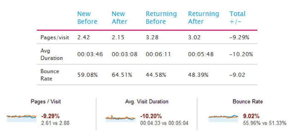
The pop-up prevented users from reading the content just as they were getting started. The truth is that people do not like to see a pop-up, especially when it looks like an obstacle.
How to Ask for Emails Politely
Isn’t it possible to create an email list without disturbing visitors? Of course it is. All we have to do is be careful to ensure that our practices don’t look like a content barrier.
Here are some methods you can use to ask for emails without disturbing your visitors:
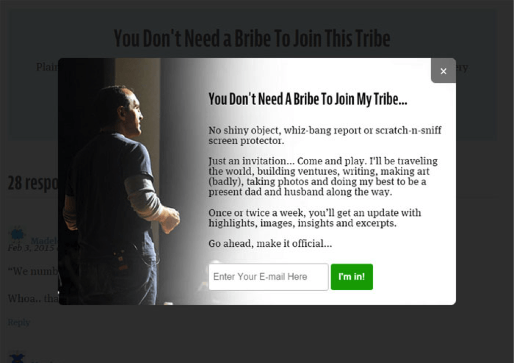
1. Present a Pop-up at the End of Your Content
If you’re not getting enough email leads, the biggest leak in your website may be that you’re not asking for emails at the end of your content.
Most visitors decide whether to subscribe or not after reading your content. By triggering a pop-up as soon as they reach the bottom of your content, you will be asking them to make the decision right away. Thus, it converts well; and sometimes it converts users who were unwilling to subscribe at the beginning.
Since this pop-up triggers when users finish reading the content, it works like a CTA and gives them direction. For that reason, it doesn’t look like a barrier.
I’m using WP Subscribe Pro plugin in WordPress, and it is effectively doing this job.
Example: Jonathan Fields is using the same thing, and it has increased his conversions.
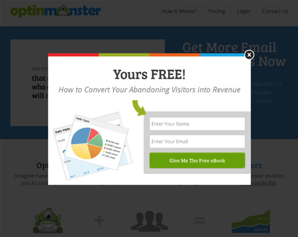
2. Introduce a Pop-up When a User Signals Exit-intent
Do you want to increase your subscribers by up to 600%? Then arrange for a pop-up to appear when a user signals an intention to exit. WPBeginner did this, and their email subscribers jumped from 70-80/day to 445-470/day.
Exit-intent is a new technology that is used to determine when a user is about to leave a site. Some list-building services have integrated it into their businesses because it works like a charm.
This is what happens: When someone is about to close or leave the browser tab, the action triggers a pop-up. As a result, the user will stop to see what just popped up.
Exit-intent pop-ups for email subscriptions get very positive results. You can use the method to convert your outgoing visitors. Set up an exit-intent pop-up with an appealing invitation to subscribe.
Example: OptinMonster provides excellent pop-up services, including this exit-intent feature. They have it running on their website as a demo.
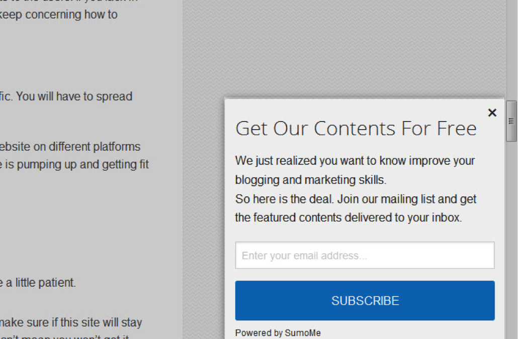
3. Slide in a Request after a Page Scrolls
One of the gentlest methods for capturing emails is to slide in a request to subscribe once someone scrolls down X% of a page. The subscribe box can slide in from a bottom corner. This type of entrance is very gentle but eye-catching, so it works perfectly.
MadMimi noticed that slide-in subscribe leads had a much better conversion rate than any regular pop-up. According to their heat map test, sliding in after 80% of a page scrolls is the best converting area for websites.
So configure a subscribe box to slide in after 70-80% of your page scrolls.
Example: I set up SumoMe’s Scroll Box on Blogging Spell, and it increased email lead conversions.
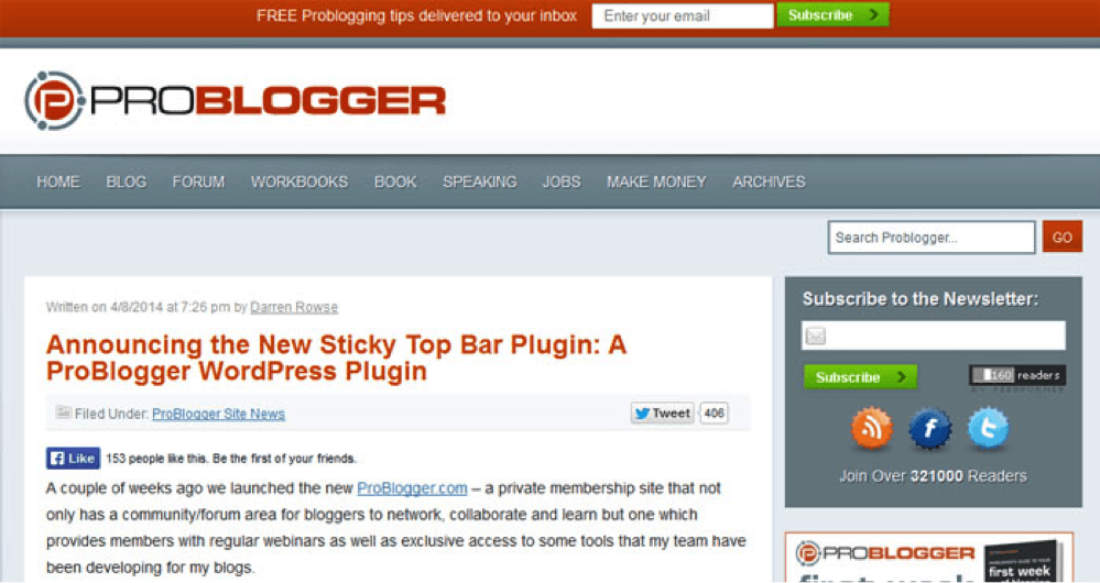
4. Display a Sticky Top Bar
Display a relatively simple, noticeable bar that stays at the top of the screen and scrolls with the page so that it remains within a user’s sight all the time. It will get attention and convert more.
The message we usually use on the bar is a call to action, but the results are pretty good using it as an invitation to subscribe, too.
A sticky top bar is a perfect, high converting place for your subscribe form, which you can use to increase your email conversion rate faster.
Hello Bar provides top bar services. It performs well and has already acquired many authoritative customers. “DIYthemes” is one of them and has gained 1,180 extra email subscribers in just 30 days of using Hello Bar.
Example: ProBlogger added a top sticky subscribe bar, and their subscribers went up by 25%.
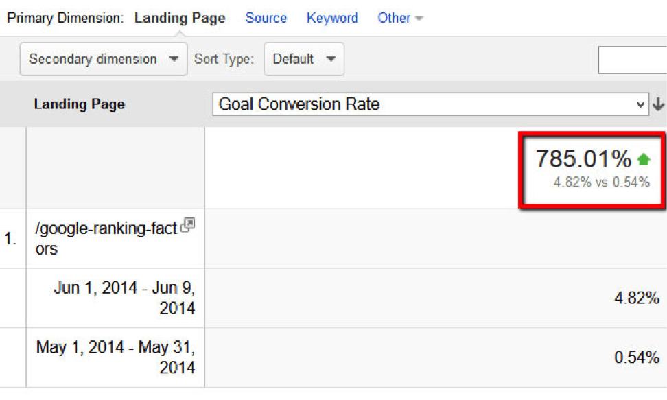
5. Offer a Content Upgrade
Whoever thought a two-step opt-in could be used so deliciously to capture emails? This is what increased Backlinko’s conversion rate by 785%.
A content upgrade is a link magnet that provides upgraded value to content as a reward for subscribing.
Suppose you’re planning to write a post “Top 3 Ways to Get Organic Traffic.” You also have a resourceful PDF “30 Different Sources of Getting More Traffic.” What you can do is offer readers a chance to download the PDF from inside the new post by opting in (giving you their email addresses).
So try providing upgrades to your content as subscribing rewards and see how it improves your conversion.
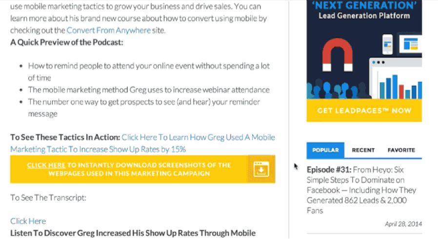
Example: LeadPages is one of the best landing page solutions. They also have a content upgrade feature. Here is a sample work:
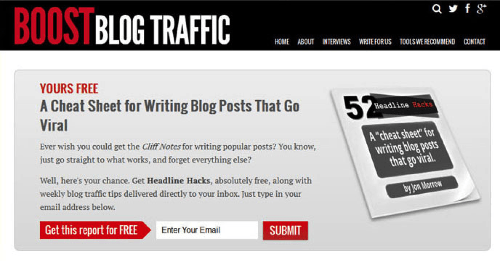
6. Stage a Welcoming Home Gate
The homepage is the most authoritative page, and sometimes the most visited page, of a website. You can leverage it to get subscribers.
The home gate or the home featured box can be used to stage a warm welcome for visitors. You can attract them right on the spot by providing a bribe to subscribe. Your homepage usually has better traffic. For that reason, you will have a chance to increase your subscription rate by up to 51.7%.
Example: When I thought of home gate, Boost Blog Traffic came to my mind first.
7. Add a Sidebar
A sidebar provides additional navigating value to users. It usually appears on all blog pages, and it’s a good place to include a subscribe form.
By setting up an appealing subscribe box on your sidebar, you can gently attract visitors to subscribe. In fact, the top of your sidebar is the best converting position for the form. It can lead to a 26% increase in subscribers.
Example: Audience Bloom’s subscribe form looks very appealing, and that’s what caused me to subscribe to their list.
8. Launch a Dedicated Landing Page
Create an optimized landing page for email subscriptions. To make it a high converting one, you can apply the following tips:
- Offer something appealing that will attract visitors.
- Design it beautifully with contrasting colors and placement.
- Include reviews or social proofs to gain trust.
- Adorn it with images or insights that will attract attention.
- Make the subscribe button noticeable. Try a colorful button like red, green, or blue.
Example: Adam Connell designed a beautiful landing page with an appealing offer, colors, images, and testimonials.
9. Position a Subscribe Box at the end of Your Content
This method is similar to the first one, “Present a Pop-up at the End of Your Content.” The only difference is that the subscribe box won’t pop up. It will stay in place as a normal subscribe box right underneath the content.
If you think that pop-ups at the end of your content will annoy people, here is the solution. Set up a regular subscribe box at the bottom of your content. Fiverr Graphic Design - Services Tailored For YouHire The Best Designers For Your Graphic Design Needs - Unbeatable Value! It will serve the same purpose, but it won’t grab as much attention as a pop-up.
Example: Matthew Woodward has one under all his blog posts.

10. Submit a Survey
Surveys are used to gather insights or votes from users. But with a few tweaks, a survey can be used as a powerful list-building weapon.
For instance, Qualaroo is an insight marketing tool. They have an interesting feature to generate email leads through a survey. What I like about it is that the method is unique. Also, it’s not at all annoying and is very effective. You will be amazed to know Qualaroo increased The University of Alberta’s subscribers by 500%.
No comments:
Post a Comment